For one of the recent features of U9K.de, I am recording video from the user’s webcam or screen.
While this video is recorded, it also directly shown to the user on the webpage.
To indicate that the recording is active, I wanted to add an overlay that you typically see on a video camera: “🔴 REC”, duration etc.
In this post I will outline my journey to creating such an overlay with HTML and CSS.
I also considered creating a vector graphic (SVG) for this purpose, however since I want to dynamically update the overlay content (e.g. duration), I came to the conclusion that just using HTML is a better fit.
#
Step 1: Borders
To put a CSS border inside of an element (instead of around it), you can use the box-shadow property.
The problem with this approach is that the borders will be all around the element (not just in the corners) and there is no way to influence that.
On StackOverflow, someone came up with a really clever way of doing corner-only borders with ::before and ::after pseudo-elements.
This is an elegant way of solving the problem, but does not fit my use case because then I cannot put any text into the corners.
Therefore, I decided to use four individual <div> elements and put them in the corner of the parent element.
This works by setting the parent element to position: relative; and position: absolute; for the child elements.
 1
 2
 3
 4
 5
 6
 7
 8
 9
10
11
12
13
14
15
16
17
18
19
20
21
22
23
24
25
26
27
28
29
30
31
32
33
34
35
36
37
38
39
40
41
42
43
44
45
46
47
48
49
50
51
52
| <style>
.overlay {
position: relative;
width: 720px;
height: 480px;
--border-style: 2px solid red;
--border-space: 20px;
}
.overlay-element {
position: absolute;
width: 150px; /* controls the length of the borders */
height: 100px; /* controls the height of the borders */
}
.overlay .top-left {
border-left: var(--border-style);
border-top: var(--border-style);
top: var(--border-space);
left: var(--border-space);
}
.overlay .top-right {
border-right: var(--border-style);
border-top: var(--border-style);
top: var(--border-space);
right: var(--border-space);
}
.overlay .bottom-left {
border-left: var(--border-style);
border-bottom: var(--border-style);
bottom: var(--border-space);
}
.overlay .bottom-right {
border-right: var(--border-style);
border-bottom: var(--border-style);
bottom: var(--border-space);
right: var(--border-space);
}
</style>
<div id="content">
<div class="overlay">
<div class="overlay-element top-left"></div>
<div class="overlay-element top-right"></div>
<div class="overlay-element bottom-left"></div>
<div class="overlay-element bottom-right"></div>
</div>
</div>
|
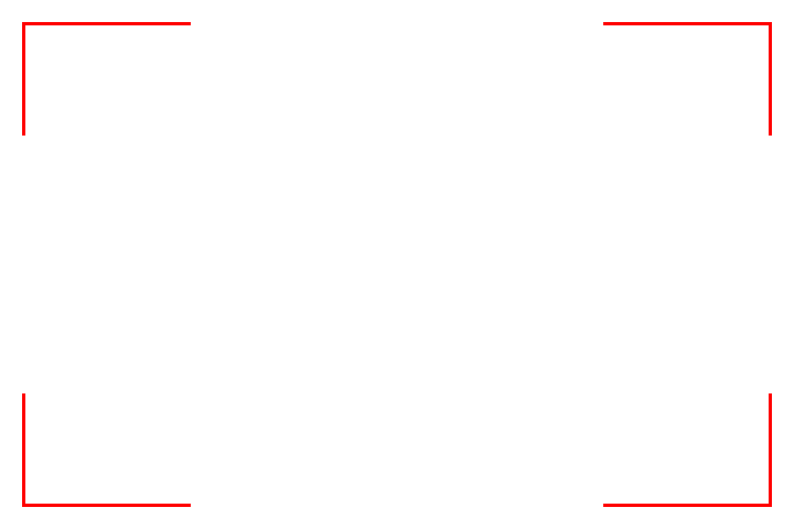
The parent overlay element has four child elements, each of them has its own class, because we need to individually address each of them in order to set the proper borders (the top-left element has borders only on the left and top side etc.).
Because the position of the child elements is absolute, setting a padding on the parent will no longer work.
Thus, in order to move the borders a bit inwards, we need to manually specify the position (top-left element is at position (x=20,y=20) etc.).
I’m using CSS variables here to avoid repeating the values of various properties over and over again, instead I can just update them in one place.
You can read more about CSS variables (formally “CSS Custom Properties”) on MDN.
This is what we got so far:
#
Step 2: Overlaying
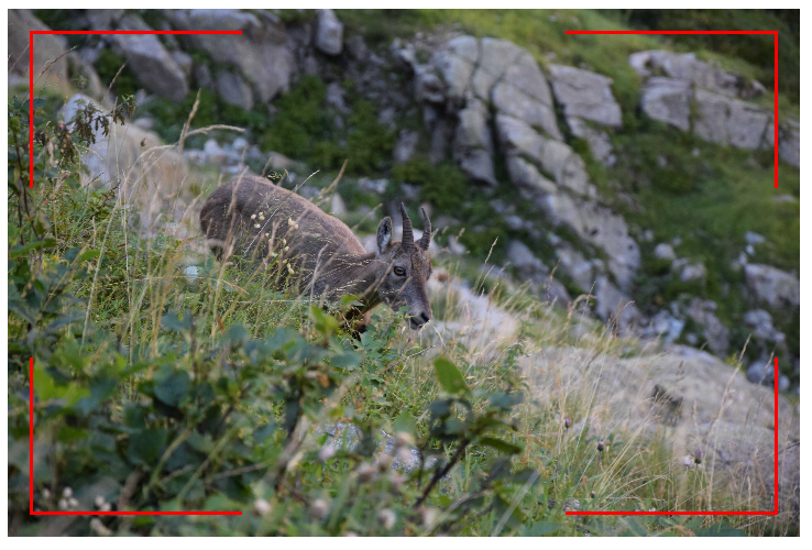
So far so good, but this is supposed to be an overlay.
Thus, next step is to figure out how to put this on top of another HTML element - a video, an image or anything else.
In this case, I will use a static image to showcase the effect, but it works the same for a video element.
1
| <img class="base" src="pic.JPG" width="720" height="480">
|
In order to put the overlay element from before in the same position as the image, we can set position: absolute; for the overlay element, because an absolutely positioned element no longer exists in the normal document layout flow (i.e. it will not occupy any space).
However, we need to remember that parent of our overlay-elements (the corner elements) needs to have position: relative.
So, we introduce a wrapper element (overlay-helper) in between.
Then we have a tree of elements with alternating position attributes: .overlay (position: absolute), .overlay-helper (position: relative), .overlay-element (position: absolute).
 1
 2
 3
 4
 5
 6
 7
 8
 9
10
11
12
13
14
15
16
17
18
19
20
21
22
23
24
25
26
27
28
| <style>
.overlay {
--border-style: 3px solid red;
--border-space: 20px;
position: absolute;
width: 720px; /* same size as the image */
height: 480px;
}
.overlay-helper {
position: relative;
width: 100%; /* make this element same size as the wrapper */
height: 100%;
}
</style>
<div id="content">
<div class="overlay">
<div class="overlay-helper">
<div class="overlay-element top-left"></div>
<div class="overlay-element top-right"></div>
<div class="overlay-element bottom-left"></div>
<div class="overlay-element bottom-right"></div>
</div>
</div>
<img class="base" src="pic.JPG" width="720" height="480">
</div>
|
Which yields this intermediate result:
#
Step 3: Adding text
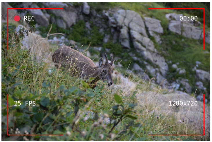
I think that upon first glance, the above picture already reminds one of a video camera.
However, it is still missing typical information, such as the recording indicator, frames per second, video resolution and recording time.
I will add these as simple text boxes (span) with a monospace font, to give it the “techy” look.
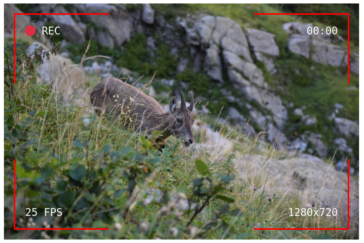
While you could just put the text directly in the overlay-element divs (in fact, this is what I did at first), this has the issue that for the bottom elements the text will be at the top of the element - instead of being aligned at the bottom (as shown in the following picture).
In general, there are all sorts of weird hacks and workarounds in CSS, but text positioning and centering can still be a real pain.
To keep it short, I added spans with overlay-text class into the overlay-element divs:
 1
 2
 3
 4
 5
 6
 7
 8
 9
10
11
12
13
14
15
16
17
18
19
20
21
22
23
24
25
26
27
28
29
30
31
32
33
34
35
36
37
38
39
40
41
42
43
44
45
| <style>
.overlay-text {
font-size: 1.75em;
color: white;
font-family: monospace;
}
#overlay-bottom-left-text {
position: absolute;
bottom: var(--border-space);
left: var(--border-space);
}
#overlay-bottom-right-text {
position: absolute;
bottom: var(--border-space);
right: var(--border-space);
}
</style>
<div id="content">
<div class="overlay">
<div class="overlay-helper">
<div class="overlay-element top-left">
<span id="overlay-top-left-text" class="overlay-text">
🔴 REC
</span>
</div>
<div class="overlay-element top-right">
<span id="overlay-top-right-text" class="overlay-text">
00:00
</span>
</div>
<div class="overlay-element bottom-left">
<span id="overlay-bottom-left-text" class="overlay-text">
25 FPS
</span>
</div>
<div class="overlay-element bottom-right">
<span id="overlay-bottom-right-text" class="overlay-text">
1280x720
</span>
</div>
</div>
</div>
<img class="base" src="pic.JPG" width="720" height="480">
</div>
|
Which yields this final result:
#
Step 4: Adjusting overlay size
If the dimensions of your base content are not known beforehand, for example because the user provides the video file, you can use the following JavaScript code to automatically adjust the size of the overlay to the base content (works for video and audio elements).
1
2
3
4
5
6
7
| const overlay = document.querySelector("#overlay");
const base = document.querySelector("#base");
base.addEventHandler('loadedmetadata', function(e) {
overlay.style.width = `${base.offsetWidth}px`;
overlay.style.height = `${base.offsetHeight}px`;
});
|
offsetHeight and offsetWidth represent the total amount of space an element occupies, including the width of the visible content, padding, and borders (MDN: Dimensions of Elements).
#
Full snippet
The only thing left to do now is adjusting the styling to your liking.
You can change the font and size, depending on your image or environment you might need to change the colors a bit (for example, when you have a light background, you should use black for the text instead of white).
Of course, updating the content in text boxes (resolution etc.) is also necessary.
If you are displaying a video, you can use JavaScript to dynamically set the framerate and playback time, as well as animate the “REC” indicator.
But I’ll leave that implementation to you.
Here is the full HTML + CSS snippet. Feel free to copy & paste!
  1
  2
  3
  4
  5
  6
  7
  8
  9
 10
 11
 12
 13
 14
 15
 16
 17
 18
 19
 20
 21
 22
 23
 24
 25
 26
 27
 28
 29
 30
 31
 32
 33
 34
 35
 36
 37
 38
 39
 40
 41
 42
 43
 44
 45
 46
 47
 48
 49
 50
 51
 52
 53
 54
 55
 56
 57
 58
 59
 60
 61
 62
 63
 64
 65
 66
 67
 68
 69
 70
 71
 72
 73
 74
 75
 76
 77
 78
 79
 80
 81
 82
 83
 84
 85
 86
 87
 88
 89
 90
 91
 92
 93
 94
 95
 96
 97
 98
 99
100
101
102
103
104
105
106
107
108
| <!DOCTYPE html>
<head>
<meta charset="utf-8">
<title>Overlay</title>
<style>
.overlay {
--border-style: 3px solid red;
--border-space: 20px;
position: absolute;
width: 720px;
height: 480px;
}
.overlay-helper {
position: relative;
width: 100%;
height: 100%;
}
.overlay-element {
padding: 20px;
width: 150px;
height: 100px;
position: absolute;
}
.overlay-text {
font-size: 1.75em;
color: white;
font-family: monospace;
}
.overlay .top-left {
border-left: var(--border-style);
border-top: var(--border-style);
top: var(--border-space);
left: var(--border-space);
text-align: left;
}
.overlay .top-right {
border-right: var(--border-style);
border-top: var(--border-style);
top: var(--border-space);
right: var(--border-space);
text-align: right;
}
.overlay .bottom-left {
border-left: var(--border-style);
border-bottom: var(--border-style);
bottom: var(--border-space);
left: var(--border-space);
text-align: left;
}
.overlay .bottom-right {
border-right: var(--border-style);
border-bottom: var(--border-style);
bottom: var(--border-space);
right: var(--border-space);
text-align: right;
}
#overlay-bottom-left-text {
position: absolute;
bottom: var(--border-space);
left: var(--border-space);
}
#overlay-bottom-right-text {
position: absolute;
bottom: var(--border-space);
right: var(--border-space);
}
</style>
</head>
<body>
<div id="content">
<div class="overlay">
<div class="overlay-helper">
<div class="overlay-element top-left">
<span id="overlay-top-left-text" class="overlay-text">
🔴 REC
</span>
</div>
<div class="overlay-element top-right">
<span id="overlay-top-right-text" class="overlay-text">
00:00
</span>
</div>
<div class="overlay-element bottom-left">
<span id="overlay-bottom-left-text" class="overlay-text">
25 FPS
</span>
</div>
<div class="overlay-element bottom-right">
<span id="overlay-bottom-right-text" class="overlay-text">
1280x720
</span>
</div>
</div>
</div>
<img class="base" src="pic.JPG" width="720" height="480">
</div>
</body>
</html>
|
As I mentioned in the introduction, I developed this overlay for a new feature of U9K.de: Camera & Microphone Test - go check it out!